Finding the right legal representative can be challenging, so I set out to simplify the process by creating a more intuitive searching experience that helps users connect with the right attorney more easily.
Norris McLaughlin is a law firm that provides comprehensive legal services to families and businesses across a range of industries. With over 200 attorneys serving clients multiple locations, their growing practice requires a website that acts as both a sales tool and a bridge between clients and attorneys.
MY ROLE
As the UX designer on this project, I collaborated with team of project manager, and UX researcher to design over 40 unique pages for the website. My role involved conducting user research, brainstorming, building wireframe, and developing the final prototype to deliver a seamless and effective user experience.
Starting point
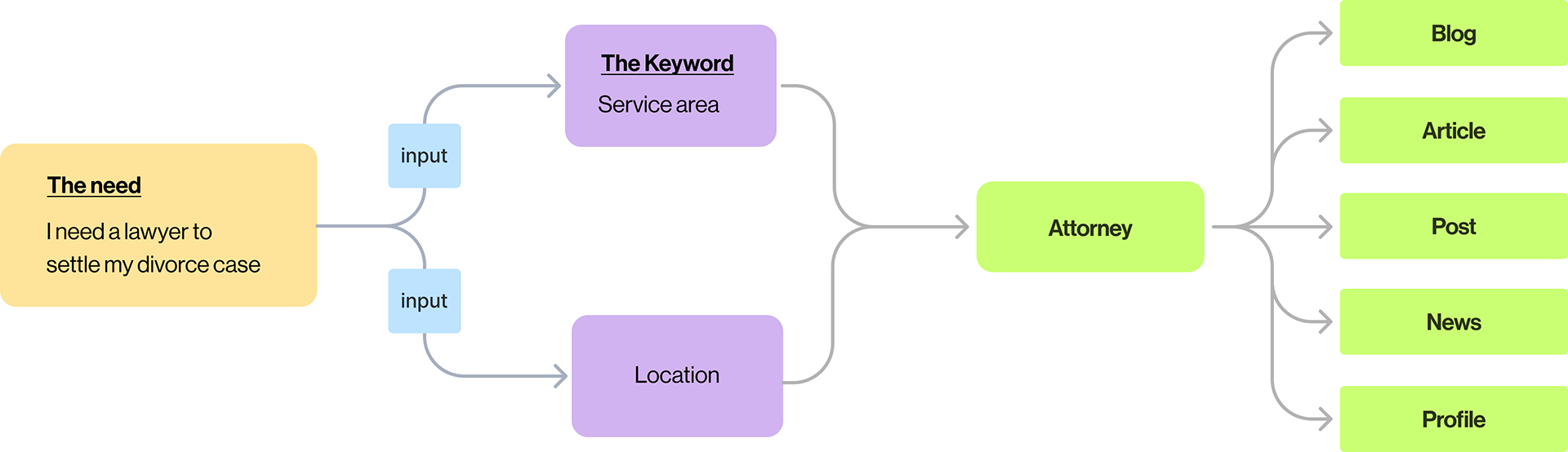
When people seek legal services, their decision-making process is distinctly different from shopping on an e-commerce site like Amazon. I went through the process if I were to hire an attorney, where do I start?
Users typically have a specific case, such as "I need to apply a permit for my new restaurant." "I'm going through divorce" These users either have a problem to solve or foresee a potential issue.
This highlights two key factors: 'The Need' (resolving an issue) and 'The Keyword' (the relevant legal practice area). With this understanding, I focused on building the primary features on the platform which is to search and find the attorney,
Identifying areas for growth
After completing the discovery phase and analyzing the current website, I identified three key areas for improvement: the search feature, navigation, and attorney profiles. These issues significantly impacted the overall user experience.
ENHANCING THE SEARCH FEature
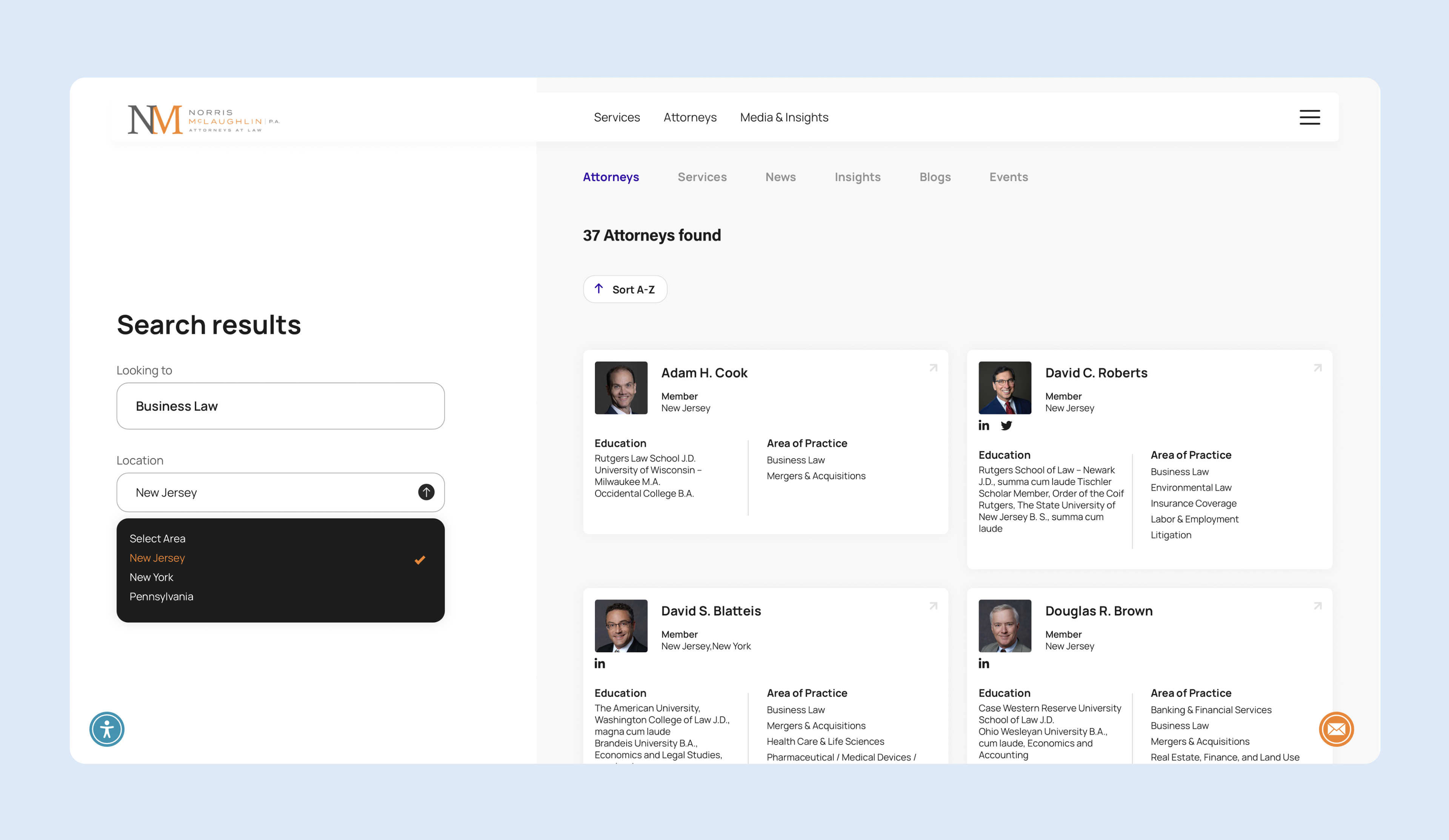
The primary task for users on the NM website is to find an attorney who specializes in the legal services they need, in the appropriate location. However, the current search feature was not prominent and didn’t fully utilize its potential.
content organizaton
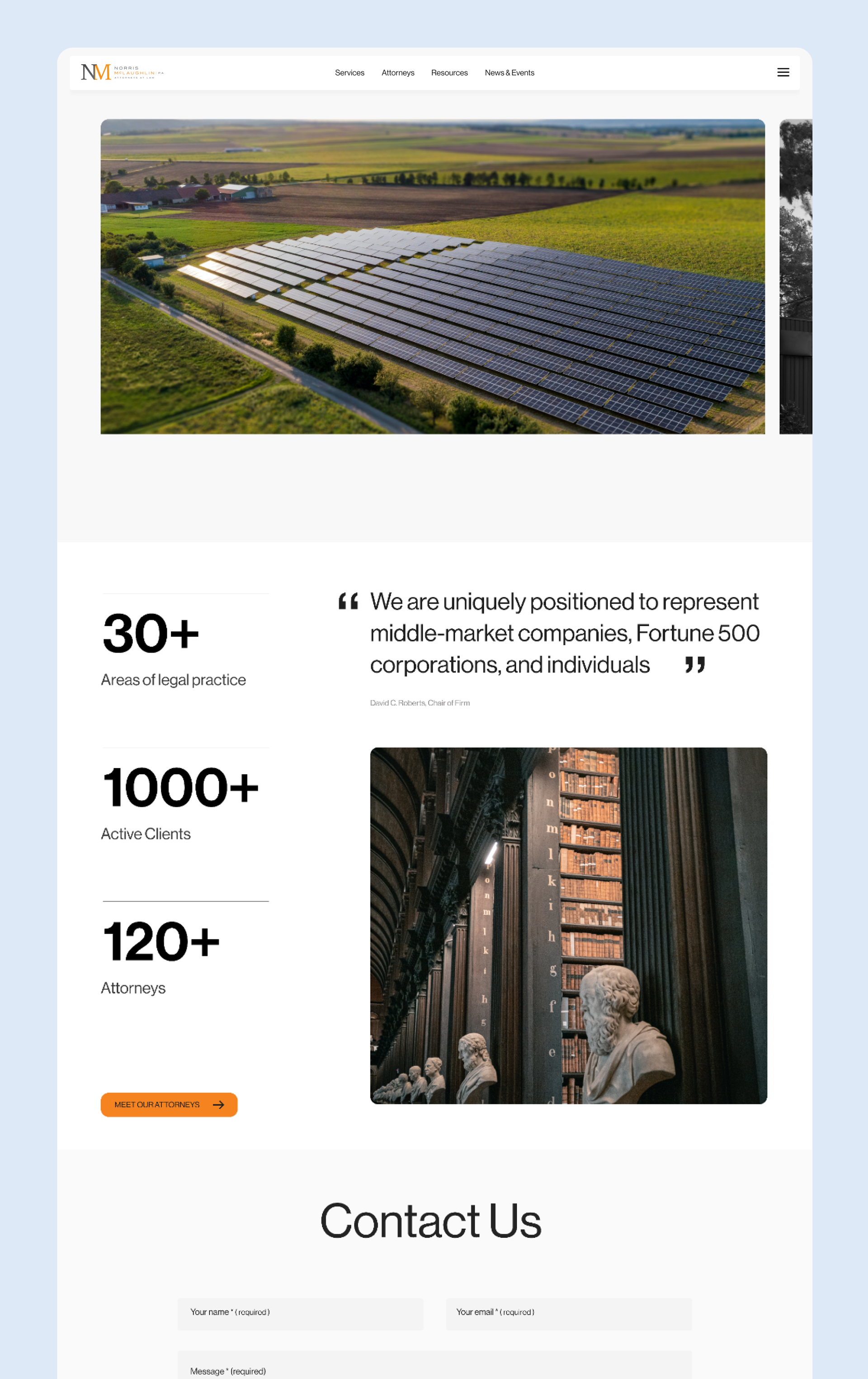
The website is rich in content, including attorney profiles, articles, blogs, events, and podcasts. With hundreds of posts written by attorneys, the information was accessible but poorly organized, resulting in poor accessibility and hidden content.
SIMPLIFYING USER JOURNEY
The website serves three main user groups; potential clients, lawyers, and internal staff, each with different tasks to accomplish. However, the current website had a complex user journey, offering no clear direction for users to complete their tasks efficiently.
Reiterate Searching experience
Primary feature
The main question I addressed was, "How do clients find an attorney and relevant legal information?" I created a user scenario where clients are guided through a single, streamlined journey. This concept revolved around designing a systematic information structure, enabling users to explore content related to their legal needs with ease.
Think of it like a Google search, in a few keywords you get results to the right attorney, articles, news, and related content.
Designated portfolio space for Lawyer
Norris Mclaughlin is a mid size law firm that provides services in multiple locations with total of 200 attorneys and more than 50 different practice area. One crucial point that I discovered on the initial user research was the needs of each lawyer to showcase their work, profile, awards, and contact information.
The solution here is to give a designated space for each lawyer to showcase their profile and contents which essential for clients and should be accessible at all times.
The focus is how can we present all-information related to a lawyer David without requiring users to jump between multiple pages?
I developed a concept to showcase each attorney's profile, background, expertise, and related content in a user-friendly format. This approach allows attorneys leverage their online presence as an effective marketing touchpoint while giving potential clients seamless access to explore their complete profile.
Simplify Navigation
While having extensive information is valuable, presenting too much at once can overwhelm users and distract them from their primary task. By reorganizing the site’s structure and eliminating unnecessary links in the primary navigation, I simplified the navigation to focus only on essential elements. This allows users to quickly access what they need, such as finding an attorney or learning about legal services.